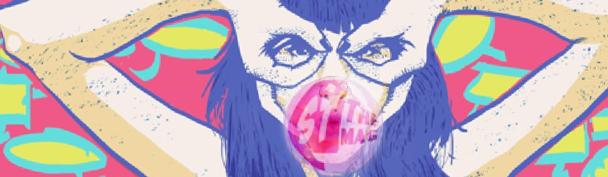
Tease of the Month: Aditya Bidikar
Great that you have finally been initiated into the world of comics. Star struck by the likes of Gaiman, Sacco, Miller and some more, you have finally realized that yes, comics aren’t just child’s play and there are more to these “picture books” than you ever thought there could be. While that is definitely quite a start, I wonder how many of you have ever wondered about the words that flow so seamlessly across the pages, adding a kind of beauty only perhaps the enthusiasts admittedly worship… With the turn of each page and the pop of every speech balloon, it is quite saddening to realize that though letterers are some of the most important people involved in the creation of comics, lettering is yet to be accepted as an art by most who choose to swear by the medium of comics.

Back in those days:
Though speech filling up balloons and sections of panels can be traced back to the 1900s, for the longest time, lettering was indeed a job that was considered to be a part of the artist’s duties as they drew out the pages and brought to life the stories. It was only after the 1940s, when the world saw comics gain incredible popularity accompanied by a definite increase in production as well, that the letterer and the colourist stepped into limelight, proving to the world the importance of their roles- roles that till now were considered to be trivial. And the letterers did all they could to make the comic experience an even better one! From calligraphy to text placement, for a medium that is so dominated by largely visuals. text proved to add to the graphics an artistic way of narration that was undeniably critical for the growth of the medium. By playing around in limited spaces and shapes, the job of a letterer in no way is easy!

The Fine Art of Lettering:
For the layman, lettering is essentially the presentation of the words in a comic. This includes the dialogue, the captions, the special effects (BIFF, BANG, BOOM etc.) and the display lettering (that is, the title, credits and the ‘Next Issue’ blurb). To explain it to someone outside comics, it’s design of a certain kind, with bits of illustration, some composition thrown in, and a whole lot of storytelling. And this issue, we speak to Aditya Bidikar, letterer, Liquid Comics.
Starting from his first professional job in Northern Song, Aditya has also been a part of the first issue of Autopilot created by Kishore, Sinu and Roshan of Libera Artisti. “I’ve lettered two comics for the Hyderabad Graphic Novel Project, of which one is being released in print as a part of their first collection. I’ve also done the lettering for David Hahn’s All-Nighter and Tony Lee’s MacGyver: Fugitive Gauntlet, both published by Image Comics. And I wrote, lettered and produced a monthly comic (most of them drawn by Nitin) for Kindle Magazine, based in Kolkata, for around a year,” he stops for breath.
Stepping away from the basic mainstream lettering that define most comics, Bidikar’s experimentation with fonts that look hand-drawn was because he felt they have more personality. “I’ve been reading a lot of comics from different eras and trying to emulate the lettering in them – such as the grim, rough style of old crime comics, Abe Kanegson’s open, inviting style on Will Eisner’s work, and even Artie Simek’s work for early Marvel Comics. I sometimes use the lavish style pioneered by Franco-Belgian artists, with wide, airy balloons and flourishy tails. I’m currently obsessed with British letterer Tom Frame’s intricate lettering style, and I’m also looking at the work of one of the masters – Gaspar Saladino – to learn how he effortlessly adjusted his style to different artists,” he explains further.

Font Frenzy
Faced with the difficult job of choosing a font, Aditya believes that with enough practice, it can be something quite simple. “Choosing fonts is a difficult thing to learn, because no one can teach you, but there comes a point when it becomes second nature (I’m hoping that happens soon for me). So I look at the mood of the story and the art and see what would be a good style to use, and what font would fit well with that style. I know that’s a desperately vague answer, but it’s really not something that works according to a formula.”
Starting with reading a script, then progressing to making notes about ideas, he starts work on the lettering by taking up a presentation page in a few different styles before finally figuring out which font he’ll use. “If it’s a more complex project, I’ll create a stylesheet – for example, when I’m lettering a fantasy comic with a lot of different kinds of monsters, I figure out the different balloon styles for different characters in advance, so that I have a quick reference to maintain both speed and consistency,” he says.
Working one page at a time, the task of lettering a 22 page long comic takes him two days, but of course, more complex styles can take much longer. Being a commercial artist, he confesses that he prefers to work backwards from the deadline! “If time is at a premium, I’ll keep my experimentation to a minimum and finish the work the best way I can within the time given. After doing the initial pass, I like to take a day away from the comic, and come back and try to look at it with fresh eyes, to see if I’ve missed something, or if I can improve on it in some way,” he admits.
Faced with the question of why letterers are still overlooked, he had quite a fitting explanation- “Good lettering should be invisible, that it should integrate itself so well into the artwork that you shouldn’t actively notice it. I don’t agree with this entirely, but it does hold true in most cases. The result is that people only notice lettering when it’s badly done. Even I rarely noticed lettering before I started playing with it myself. Secondly, with the advent of digital lettering, people think that there’s nothing more to lettering than placing the words on the page, choosing a ‘comic-booky’ font and getting it into a roughly oval shape, which is far from the truth. I suppose this is just a cross we have to bear. On a personal note, I still look for a mention of my lettering in every review I read of a comic I worked on, and got unduly excited the one time I saw one!”

Finally as the interview draws to an end, Bidikar shared with us a note about his favourite letterers of all time:
Among the old hand-lettering guys, I love the work of Gaspar, who created a lot of the old DC logos, and did a staggering amount of work on a lot of classic comics (and is still coming up with new work now), Ben Oda, who did a lot of very impressive journeyman work, John Costanza, who lettered some of my favourite comics from DC and Vertigo, and Tom Frame, who pretty much defines British lettering for me.
Some of the hand-lettering veterans effortlessly managed the shift to digital lettering, such as Todd Klein, who shifted his focus to creating some of the best title work of recent times, and Clem Robins, who puts a frankly insane degree of dedication into making his digital font and balloon work look hand-done, so much so that even one of the colourists working with him didn’t know he’d shifted to digital until much later. John Workman recently joined their ranks, but I have to say my favourite work of his is still his collaboration on Thor with Walt Simonson. I also have a lot of affection for Willie Schubert and his distinctive style on a lot of comics from the 90s.
Among the new guns, Nate Piekos of Blambot constantly stuns me with his versatility (in particular what he’s currently doing on Richard Corben’s books) and the fact that he creates two completely new typefaces every month and always offers one of them free for use in independent comics. I also must note Jack Morelli, who does some excellent hand-lettering for Archie Comics, and Dustin Harbin, who hand-lettered the coloured reprints of Casanova.
Finally, I have to say that there is no letterer quite like an artist who letters himself by hand. Walt Kelly’s Pogo is peerless in this, but I also love some other strip artists who did lettering, like Charles Schulz on Peanuts, Bill Watterson on Calvin and Hobbes and Burne Hogarth, who, if I remember correctly, lettered himself on the Tarzan Sunday strips. On the book side of things, Dave Gibbons did some amazing lettering stuff in Watchmen, Steve Parkhouse is still the best person to letter his comics, and Stan Sakai letters Usagi Yojimbo by hand, always turning out amazing work, and has also been lettering Sergio Aragonès’s comics since the 80s. Jeff Smith actually uses a digital font in his books, but does it so subtly that it took me ages to realise. Dave Sim, whatever you might think of the man himself, is one of the best artist-letterers to have hit Western comics, approached only by David Mazzuchelli on Asterios Polyp and City of Glass, and surpassed possibly by Dave McKean on Cages. James Stokoe has been doing some excellent Eurocomics-inspired lettering on his comics like Orc Stain andGodzilla: The Half-Century War, and, speaking of Eurocomics, I’d be remiss in not mentioning Moebius, Vincent Perriot (whom a friend of mine recently pointed out to me), Emmanuel Guibert, and, of course, Albert Uderzo, all of whose work I try to find in the original French so I can look at the lettering. Other notable artist-letterers are – Darwyn Cooke on his Parker graphic novels, Eric Shanower on Age of Bronze, Paul Grist on Jack Staff andMudman, Frank Miller on Sin City, Rich Koslowski on The King and the Hernandez Brothers on pretty much everything they do.
– Aditya Bidikar
One thought on “Tease of the Month: Aditya Bidikar”
Comments are closed.